I felt it was time to redesign and rebrand ti-ger.org and take it to the next level. To recap: ti-ger.org promotes the fantastic Tiger Analogy of Stuttering Empowerment. I liked it so much when I first heard it that I immediately designed a tiger cartoon mascot and website to go with it. In fact, it’s the companion website to my podcast, Stuttering is Cool (redesign coming soon, too!).
Updated web design and branding
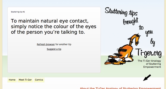
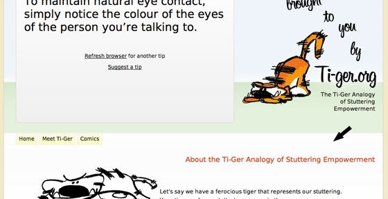
First, of course, I updated the design to reflect a more modern and engaging look. Secondly, I shaped the new brand for ti-ger.org as the definitive online stuttering with confidence handbook. I got the idea when a regular visitor told me that she frequently returns to the site to get a boost of confidence by re-reading the analogy. Also, among the most popular requests I receive from my podcast listeners is techniques for controlling stuttering. Thus, the stuttering tip box was born. It’s displayed front and centre right on the homepage. A random tip is loaded with every refresh. In order to increase the level of interactivity, I added the simple feature of enabling users to email and share their own tips which I add to the tip box.

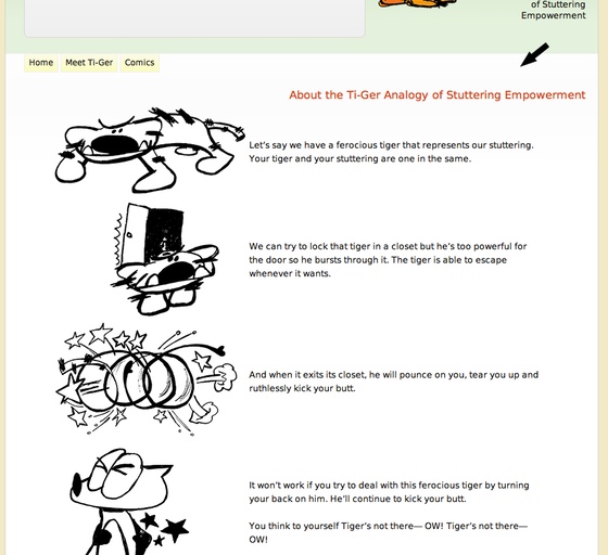
Below the tip box is the Tiger Analogy. This time, I added the same drawings I have planned for the mobile version of ti-ger.org (coming soon). This is for consistency between the two versions. I added white space to keep the reader’s interest. Otherwise, it’s a sea of scrolling text.

Bending a usability rule
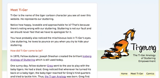
I bent the rules a little bit by having the navbar move around a bit. In other words, the site is in fact built in 3 sections. The analogy and tips on the homepage, subpages for further information and the new addition of comics.


I did this to prevent the user’s eyes from jumping around on the page. That is, the eye sees the tip box, then sees the nav on its way downward, then the analogy and footer. After clicking on a nav item and reloading a subpage, the eye won’t have to dart around to readjust to the layout. The content shows up where the eye is already at and the nav bar simply slides to the right. It stays on the same plane and keeps the same amount of white space as it did on the homepage. A mirror reflection in a tight space.
Web comics
A great way to offer tips and advice is to demonstrate them. And time and time again I read about the effectiveness of using stories to teach and make the knowledge stick. So I decided to move my comics about stuttering from Stuttering is Cool to ti-ger.org. So in actuality, this makes ti-ger.org the home of a web comic. Instead of having the comic show up on the homepage, it’s actually a sub-feature. Remember, I want the analogy to be front and centre.
More strategy
My next step is to refresh the strategy of the Ti-Ger Facebook fan page. I’ll blog about that once that launches.
P.S. Tip of the hat to Laurent Lasalle for late night CSS venting-receivership over Twitter.

Congratulations, Daniele!!!
Ti-ger.org ROCKS!!