A recurring issue that pops up at digital accessibility conferences and forums is how to get buy-in from colleagues and vendors to incorporate accessibility into staff workflow and part of their design process and not as an afterthought for a “next time” that never happens.
Having experienced this many times throughout my career in coaching various content creators not knowledgeable in digital accessibility and encouraging them to include it in their workflow by outlining the many win-win benefits of doing so but only to end up seeing no change and the same barriers repeatedly making up the great majority of errors in accessibility audits (wow that was a long sentence!), I thought I’d try a new tactic.
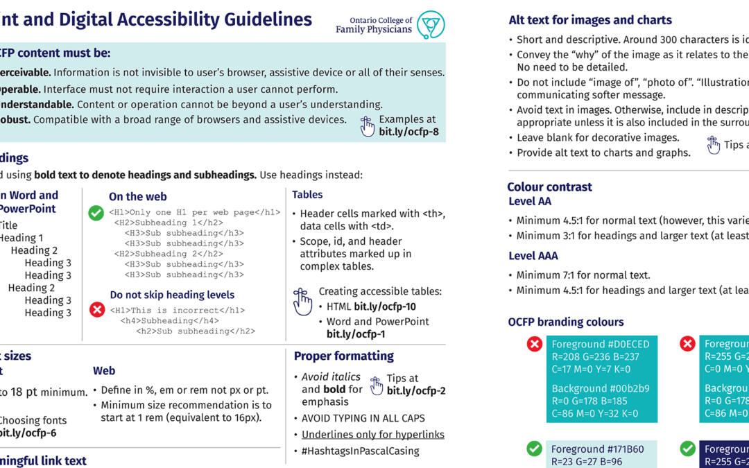
I created an at-a-glance guide with short examples of the common barriers and what to do and what not to do.
- I focused my guide around the production process using:
- Word, PowerPoint
- Graphic design (for print assets, social media posts) and
- Websites and intranets (using content management systems or manual coding)
Making learning digital accessibility quick
I designed my guide like an organisation’s branding guidelines document with visual examples conveying dos and don’ts laid out in a way making it easy for busy colleagues to scan and retain – I designed it using the organisation’s policy and process template so it becomes official.
I also used copy and design examples typical of the organisation to offer relevant takeaways.
Since the amount of digital accessibility knowledge one needs to know is so vast, I focused my quick guide around the most common barriers that I have seen repeatedly come up in the workplace over the years. Common barriers such as people bolding headings in Word documents instead of using styles which, in turn, creates PDFs that are also not accessible.
My goal was to start with the basics, then, hopefully, colleagues will be interested in learning more. Thus, I also included shortened links to expert third-party information on the whys and hows as well as Microsoft help files.
Learning the basics also enables colleagues to apply what they learned from my guide as they create content regardless of software. So not just Word or PowerPoint as I listed earlier, but also Canva, the corporate intranet or any social network.
Making future requests for providing content in other formats a lot more efficient
My focus on Word and PowerPoint is obvious as they are the major office software that is used by all. Thus, creating accessible source documents in Word and PowerPoint helps with any future incoming requests from people who ask for your organisation’s content to be supplied in other accessible formats such as larger text.
This was one of the seeds that formed my at-a-glance-guide idea in the first place. A request came in at a previous workplace a few years ago that asked for content in a multi-page PDF to be provided in large text. Since the original Word document did not seem to exist, I manually re-typed it as optical character recognition software was not able to interpret the PDF. I also added the appropriate headings and such to ensure the resulting PDF was accessible to screen readers.
I thought to myself then that if everyone in the organisation had the knowledge and understood the benefits of creating accessible Word docs, it would make it really efficient to translate all their content into other accessible formats in the future. Be it for people with low vision, use as a script for a video, or what have you. Accessibility isn’t just for people with disabilities. Accessibility benefits everyone.
When branding colours don’t make an accessible combination
The other seed for my idea came from working for a client whose branding colours did not make an accessible text colour combination on social media posts or print assets.
As I mentioned earlier, I designed my guide similar to an organisation’s visual branding guidelines. My initial goal was to make my guide no longer than two pages (my client’s suggestion which I liked very much when I mentioned my guide idea). This is so colleagues and vendors can print out the guide, keep it on their desk, and quickly glance and scan what they need to do and not do.
I figured you can teach someone once but they may forget if they don’t have a chance to regularly practise their new knowledge.
A few highlights:
- I added a colour palette to show which combination of the branding colours are and are not accessible along with their corresponding RGB, CMYK, and HEX codes.
- I added dos and don’ts for writing accessible copy, descriptive links, alternative text for images and included shortened links to websites explaining the reasons behind each of these best practices and compliances.
- I added a section about creating accessible tables in both Word and HTML.
- I also added a last updated date to communicate that this is an evolving document to the organisation’s needs and updates to WCAG and other accessibility compliance guidelines.
- I added a link to WAI resources for people in various areas of an organisation as a way to learn more according to a person’s role.
The result
I had my team look at the document to ensure there were no areas that were unclear. I published after a few adjustments and unleashed it to the organisation.
While it’s still too soon to measure what kind of impact my document created, I have noticed changes so far! A colleague also recently told me “I hear your voice in my head every time I work on a Word document”. A good sign.
This is a living document, of course, as accessibility standards and office tools evolve. For instance, the POUR principles are proposed for elimination in WCAG 3.0 as is the renaming of A, AA and AAA levels to bronze, silver, and gold since the creation of my guide. So I am planning on removing those sections once 3.0 becomes official.