
That infographic, comic, or other kind of visual you want to post on social networks that you or your team worked on and can’t wait to unleash to the world… may only end up getting parts cut off across social networks. Unfortunately, each social network (and app – they have their own dimensions, too) has its own dimensions for showing visuals in news feeds making it a little time consuming for content producers to have to retrofit visuals so users across networks see what they need to see. Especially any wording.

This is how one of my promos turned out on the Twitter desktop app for the Mac. Creepy eyes and the wording… can you even see the wording??
This is important because a golden rule of user experience design is never expect/assume users will click on your fascinating content without knowing what to expect. They may not think it’s as fascinating as you do. So if part of your promo copy has been cut off on a Twitter feed, your promo will look ugly and incomplete. Not your fault of course. It just makes your hard work a little less engaging.
Fortunately, someone has found a one-size-fits-all template. Until the next time social networks and apps make new, quick changes to their sizing. But for now, check out this brilliant post, One Image to Rule Them All: Size Specs to Work Across Social Media, Garrett Heath of Rackspace Digital. It offers a template that works for most major social networks. I gave it a try for the most recent campaign that I ran and it worked like a charm.
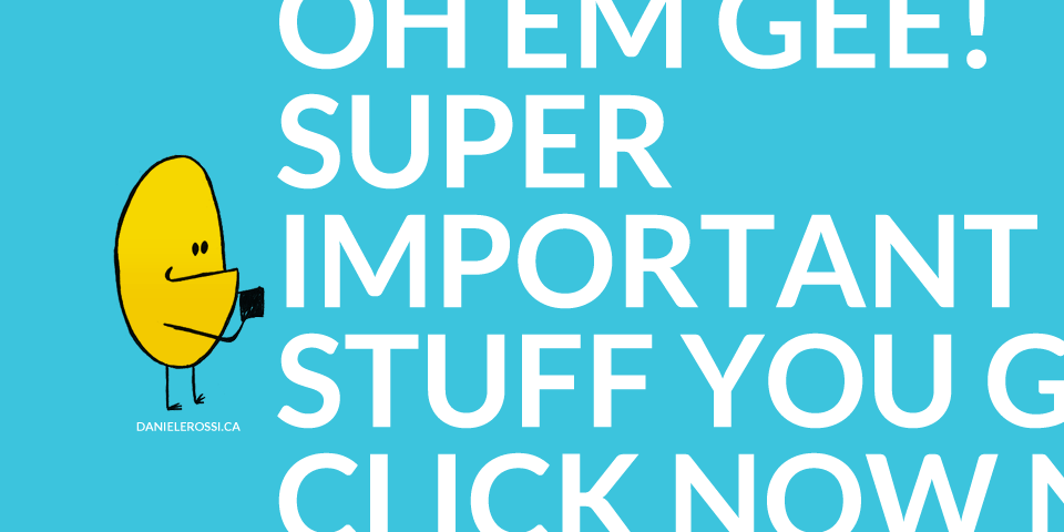
Show the best part of a long infographic
Keep in mind that the dimensions used on social networks tend to be rectangular and horizontal (or square like on Instagram). Infographics and multi-panel comics are vertical and can become quite long. In cases like these, I like to create a snippet of the most interesting/engaging part of the infographic or comic and make a promo ad out of that. Optimized for all social networks as much as you can. I also include this snippet at the top of my post so it can become one of the image options for users to choose from when sharing. Hopefully they choose the right one!
What method do you use to ensure large graphic like infographics and comic strips show up optimally on social networks?