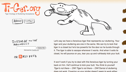
I just launched Ti-Ger.org with my friend. The idea for this new website came after listening to my friend’s analogy of stuttering acceptance on his podcast (which you can read about right on the ti-ger.org homepage).
The analogy inspired me (I stutter) to draw a tiger cartoon whose name I crowdsourced with my fellow stutterers on Twitter. “Ti-Ger” was chosen. Get it? It’s a stutter :)
Next thing I knew, my friend and I were discussing creating a website though we didn’t know exactly what the site would be used for. While I never like designing without content, we knew the analogy needed a presence immediately. So I designed around the analogy while accommodating future content.
Since accepting your stuttering is a long process which usually starts with utter disbelief, and knowing that people tend to scan when they read websites, I decided on minimal design.

Hence, the home page. There’s Ti-Ger at the top with the analogy directly below him. Can’t get any simpler than that. This way, users will read the analogy. At least I hope so.
Big gaping hole
Only, now there’s a big empty space on the entire left side of the page. I stubbornly didn’t want to include some kind of sidebar. You see, another goal I had with the design of this site is not to do what every other website already does. Yet, that big empty space doesn’t really. Especially once you reach the bottom and see the footer spanning the entire width.
I thought of adding Google Friend Connect and Facebook Connect widgets (to show supporters of the analogy), but that would clutter interface. Those widgets are in the footer. That kind of information isn’t too important for being placed beside the analogy. It’s the type of information that’s nice to know.
I thought of adding a Ti-Ger comic in the big empty space but that could cause confusion. Surely, the best way to get readers back is by setting up a mailing list or an RSS feed. Both can be done with a combination of Feedburner and WordPress, which Ti-Ger.org is built upon. I have no plans for a blog so none of the posts will be displayed. They’ll only be accessed in RSS readers. I’ll also turn off commenting and use Feedburner to send out an e-mail each time I write a “post”.
Most of the fun is on the About Us page!
Talk about breaking information architecture standards! The ‘About’ page is meant to show the community aspect of the Ti-Ger Analogy (an open source mascot for stutterers!). I didn’t want the reader to see another text-filled About Us page, therefore, I aimed for the reader to experience the impact the Tiger Analogy has on fellow stutterers— with room for additional Ti-Ger related experiences which I encourage readers to send in. The About Us page is laid out in a timeline format in a flow chart kind of way.
Translations
Stuttering affects all nationalities so I decided to offer translations of the site in as many languages as I can. Translations will be made by volunteers and at the same time, I get to learn how to code in different alphabets!
