
Responsive redesign: Improving Henry’s product detail pages
Responsive redesign: Improving Henry’s product detail pages
Project overview
Using a previously created high-fidelity mockup for desktops detailing enhancements to the product detail page as a guide, I was tasked with creating versions for mobile and tablet. These mockups were passed on to developers for implementation which I then tested and approved before launching.
My role
UX design
Responsibilities
UX design, testing
Project duration
4 days
Problem
High-fidelity mockups for desktop users had been created for developers to showcase required enhancements to Henry’s product detail pages. Mobile and tablet versions were needed before developers could begin implementation.
Goal
Design how the enhanced product detail page will look on mobile and tablet devices.
High-fidelity mockups
New elements included a sticky cart at the top once customers scrolled past the fold and a sticky navbar giving customers quick access to product information, reviews, etc. I ensured these weren’t too large on smaller mobile screens.
I presented the mockups to my team for feedback and made adjustments based on our discussion.
I then handed the mockups off to developers for implementation.
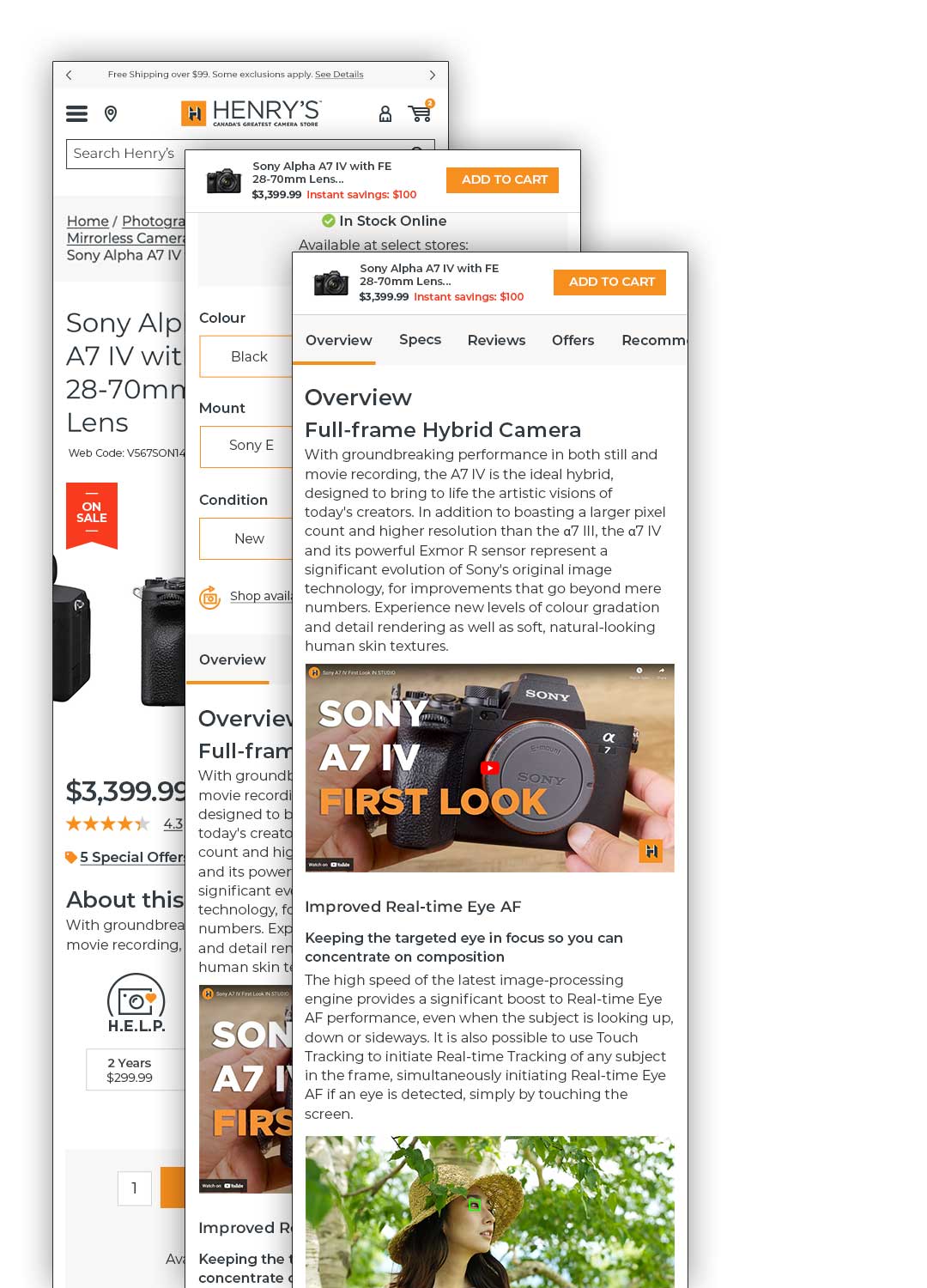
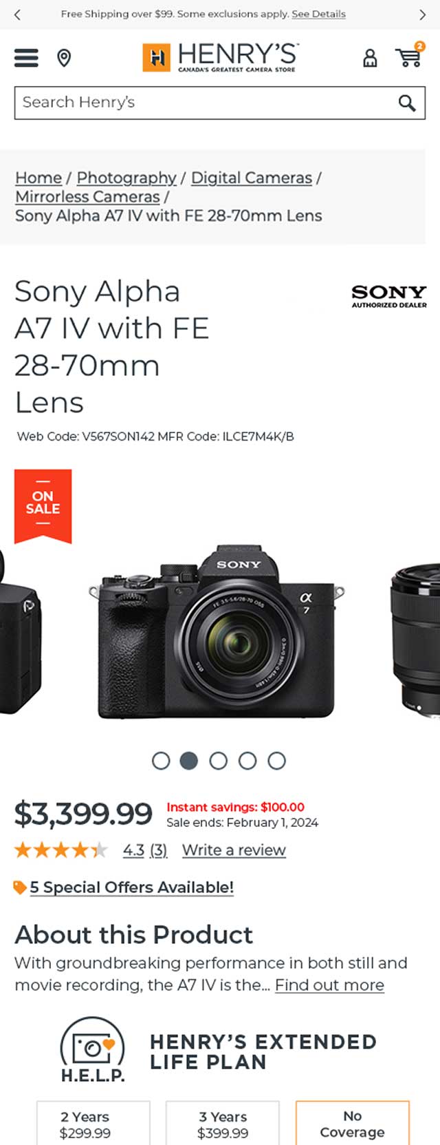
The page upon loading before scrolling on smaller screens retrofitted from desktop mockup previously created by colleague.
How the sticky cart appears at the top once the customer scrolls past the fold on smaller screens.
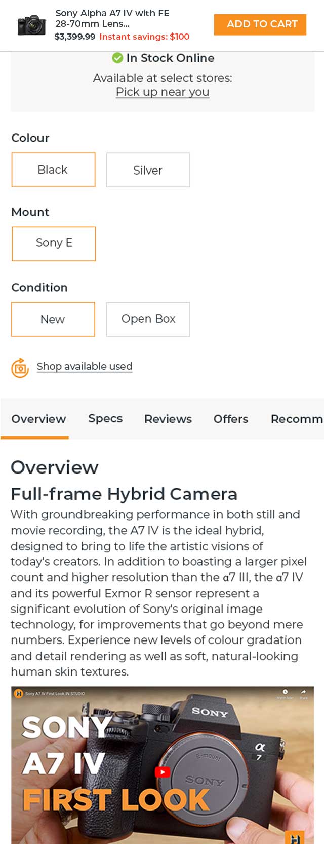
How the sticky nabvar appears and stays under the sticky cart when users scroll past its section on smaller screens.

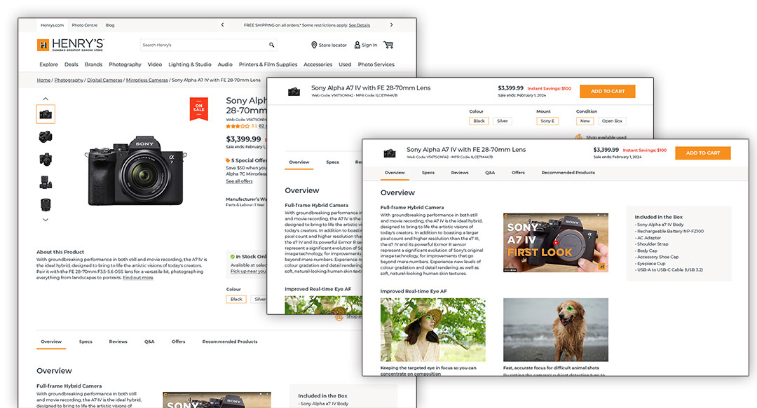
Same functionalities as above but for tablet screens.
High-fidelity mockups
New elements included a sticky cart at the top once customers scrolled past the fold and a sticky navbar giving customers quick access to product information, reviews, etc. I ensured these weren’t too large on smaller mobile screens.
I presented the mockups to my team for feedback and made adjustments based on our discussion.
I then handed the mockups off to developers for implementation.
The page upon loading before scrolling on smaller screens retrofitted from desktop mockup previously created by colleague.
How the sticky cart appears at the top once the customer scrolls past the fold on smaller screens.
How the sticky nabvar appears and stays under the sticky cart when users scroll past its section on smaller screens.
Same functionalities as above but for tablet screens.
QA testing
QA testing
Accessibility considerations
1
2
Accessibility considerations
1
2
Takeaways
Takeaways
Impact
The new design made UI elements and content a lot more engaging to users across screens.
What I learned
From the initial desktop mockup, which included enhancements like a sticky cart and sticky content, I learned that a more engaging product detail page significantly increases customer delight and satisfaction.
Post-launch enhancements
I will include these in my portfolio once they have been launched.
Post-launch enhancements
I will include these in my portfolio once they have been launched.