Improving conversion paths in Henry’s shopping experience
Improving conversion paths in Henry’s shopping experience
Project overview
Enhance the readability, SEO, and marketability of the Henry’s Photo Centre landing page by restructuring its content across three separate pages.
My role
UX designer, Information architect.
Responsibilities
UX design, web design, graphic design
Project duration
2 weeks
Before

It was a very long landing page!
After

Project overview
My role
UX designer, Information architect.
Responsibilities
UX design, web design, graphic design
Project duration
2 weeks
Before

It was a very long landing page!
After

Problem
The lengthy landing page for the Henry’s Photo Centre contained a waterfall of information about various services, making it difficult for customers to scan and cumbersome for Henry’s to promote across digital marketing channels.
Goal
Divide the lengthy landing page into three separate pages to enhance readability, improve SEO, and enable targeted promotion across social channels.
Pain points
Hindering marketing efforts
Relying on anchor links to different sections throughout the page hindered digital marketing efforts.
Information architecture
The inefficient use of screen real estate made it difficult for customers to learn about services offered by Henry’s.
Too many large images
Users had to scroll through a waterfall of large, screen-wide graphics promoting many services. This slowed load time and made it unwieldy to learn about the services offered.
Starting the design
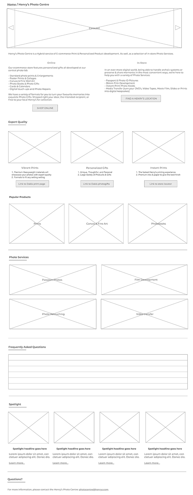
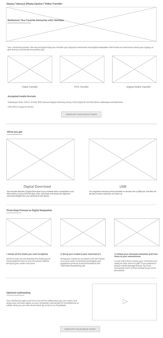
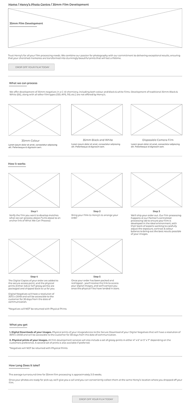
Digital wireframes
After reviewing the initial design brief and content revisions, I sketched potential layouts with pencil and paper. I then developed detailed wireframes of the winning layouts in Adobe XD and presented them to my team for feedback and discussion.


Refining and implementing final the design
Refining and implementing final the design
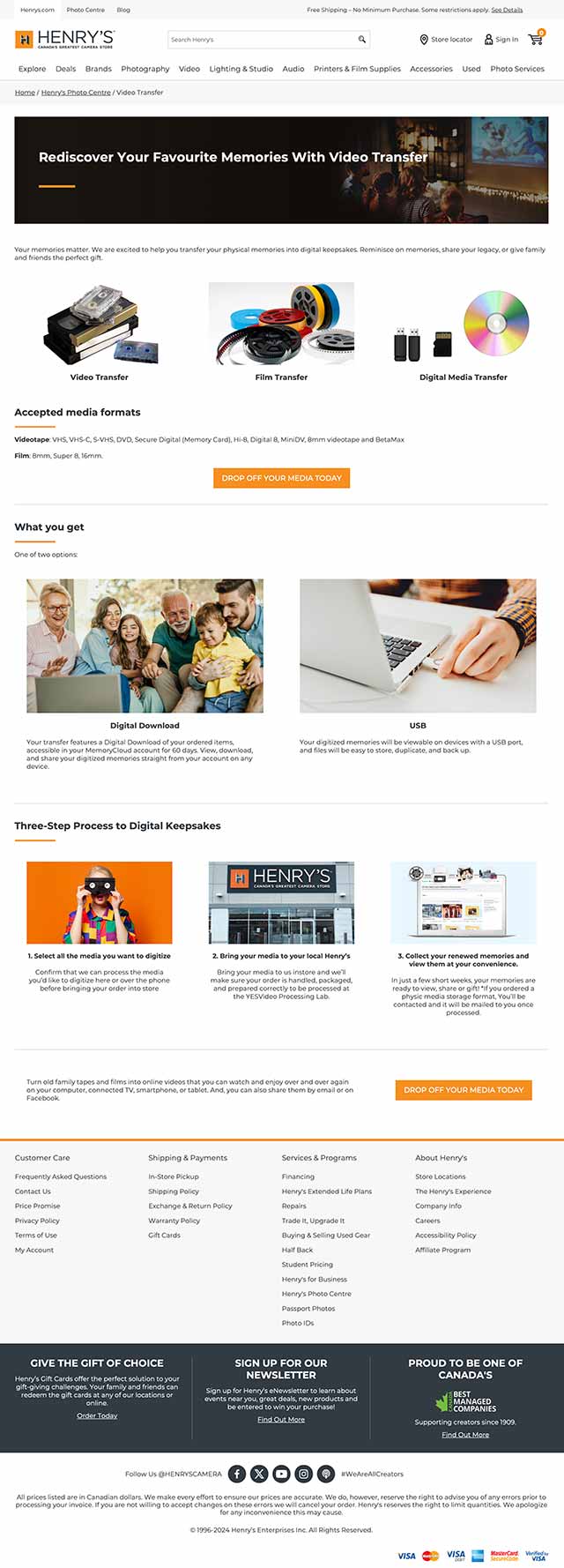
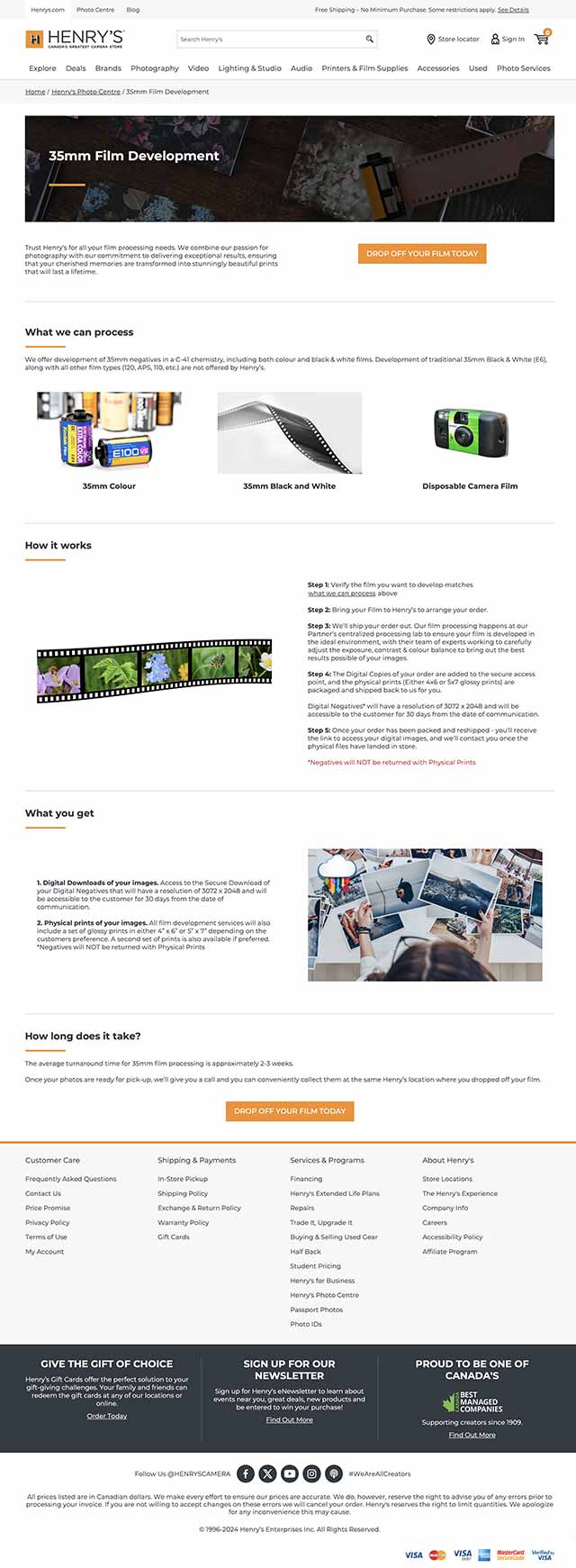
I created the web pages based on feedback and design changes discussed with my team. Graphics were provided with the exception of page hears which I designed. The resulting UI presented a less crowded website that was quicker to load and easier to scan.
It also:
- Differentiation of services available online and in store made more clear.
- Evergreen promotions for services include in prime screen real estate.
- Simplified step-by-step process for video and 35mm photo development decluttered and easier to scan.
- Unique URLs for subpages making digital marketing a smoother experience.
- Versatile carousel for short and long term sales and marketing campaigns.


Takeaways
Takeaways
The new restructured design made the content a lot easier to scan and more engaging to users across screens.
What I learned
I learned that some of my colleagues like to see wireframes ahead of team discussions, so I sent them PDFs of my wireframes with inline notes briefly explaining my design choices to make everything clear and easy to follow.
Next steps
1
Regularly review web and marketing analytics to gauge success of redesign.
2
Conduct further user research to uncover potential new areas of user needs.
Next steps
1
Regularly review web and marketing analytics to gauge success of redesign.
2
Conduct further user research to uncover potential new areas of user needs.
