DigiDoodle bug report and community microsite
Student project, Google UX Design Certificate
DigiDoodle bug report and community website
Student project, Google UX Design Certificate
Project overview
This project centers around the bug reporting feature for DigiDoodle, a free art creation app on iOS and Android tablets. While the user base is wide – typically between 13 and 50 years old – most users are art school students or people in their 40s looking to move into a new career involving illustration. DigiDoodle’s goal is to make digital illustration fun and easy for all types of users.
My role
End-to-end UX design, branding. From concept to hi-fi prototype.
Responsibilities
Conducting interviews, paper and digital wireframing, low and high-fidelity prototyping, conducting usability studies, accounting for accessibility, iterating on designs and responsive design.
Project duration
1 month
Problem
Available drawing apps tend to offer a lot of features that are sometimes missed by QA teams. These apps also tend to be missing useful features that would provide an easy, efficient user experience for artists. Reporting software bugs and requesting new features tend to be a cumbersome experience.
Goal
Design a microsite for DigiDoodle to make it very easy for users to report bugs and feature requests.
Understanding the user
User research
I conducted user interviews, which I then turned into empathy maps to better understand target users and their needs. I discovered that many of the target users enjoy submitting bugs or feature requests as a way of giving back to the team that created the app they use.
However, many bug reporting or feature request pages contain barriers that make reporting difficult, frustrating or too constricting for giving other types of feedback. This caused people to ultimately abandon the idea of submitting a report or request defeating the purpose of inviting feedback.
Pain points
Slow process
Reporting bugs on some websites require a time-consuming process via a web form.
Interaction
Most sites only offer a templated form too constrictive for other types of feedback such as compliments or requesting a new feature.
Confirmation of Interest
Bug report and feature request pages may sometimes not give any indication that the company will listen.
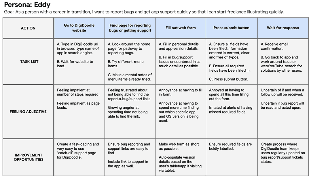
Persona
Eddy is a late-career aspiring artist who needs a fully functioning digital art app because he wants to draw portfolio pieces to gain illustration clients.

User journey map
I created a user journey map to uncover emotions and pain points people represented by the aforementioned user persona will most likely experience during the bug report process to help identify possible pain points and improvement opportunities.
User journey map
I created a user journey map to uncover emotions and pain points people represented by the aforementioned user persona will most likely experience during the bug report process to help identify possible pain points and improvement opportunities.
Starting the design
Starting the design
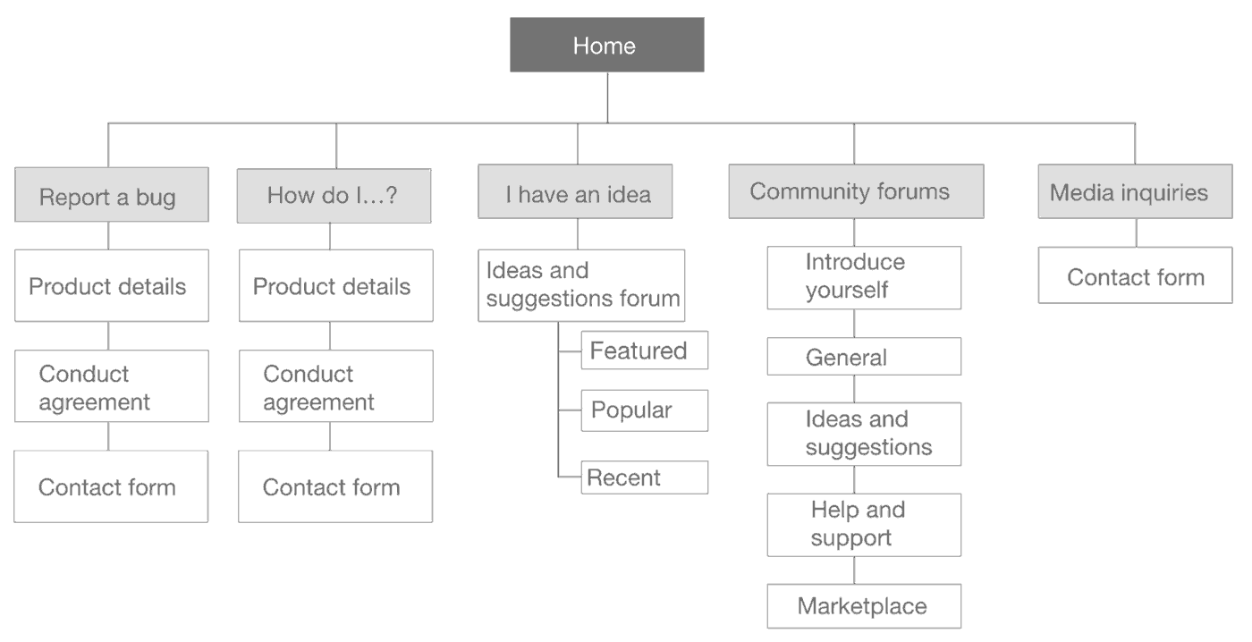
Site map
The inability to provide various types of feedback was a primary pain point for users so I used that knowledge to create a sitemap.
My goal was to enable users to provide bug reports as well as offer feedback, request features, ask for help and interact with other app users including DigiDoodle staff to feel like they are being heard.
The structure I chose was designed to make things simple and easy.
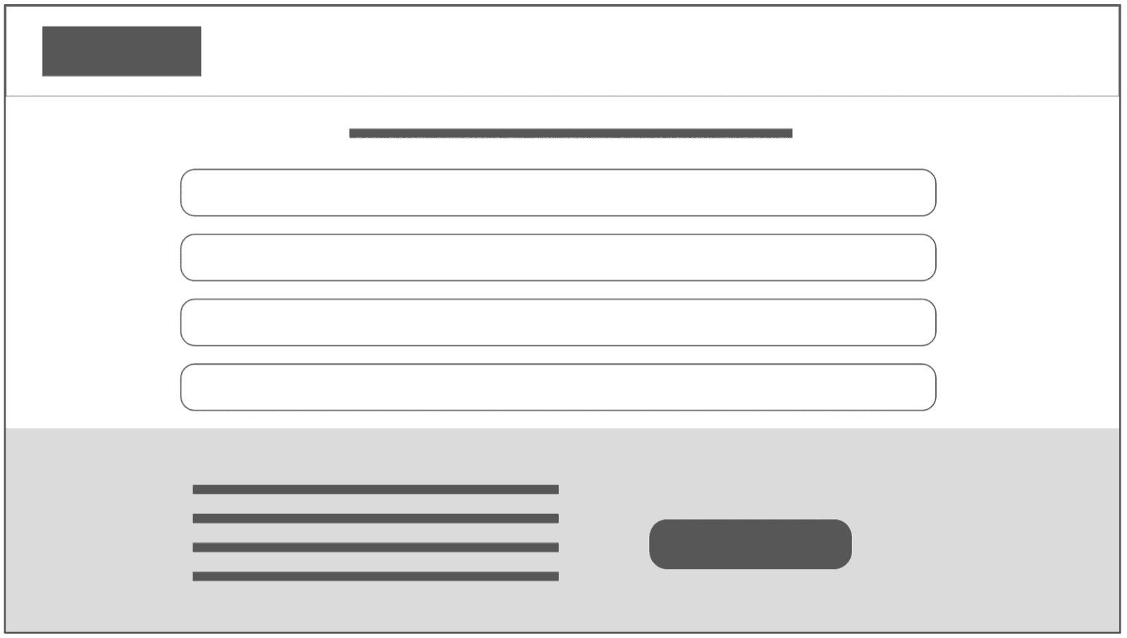
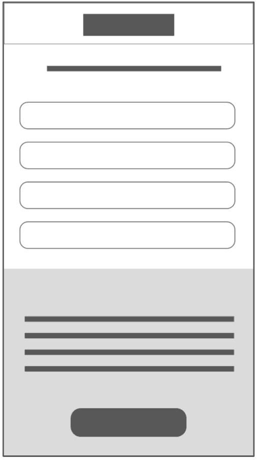
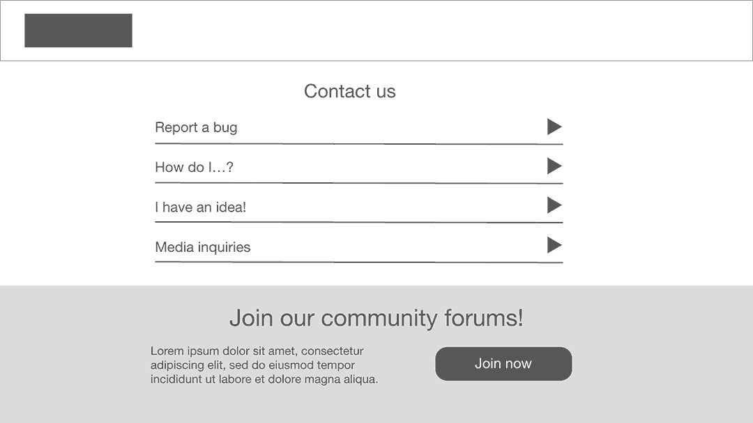
Paper wireframes
I sketched paper wireframes for each screen in the app, keeping user pain points about speed and constrictive web forms in mind.
The home screen paper wireframe variations to the right focus on pointing users to the type of feedback they want to provide.
I also designed for additional screen sizes to ensure the site would be fully responsive since DigiDoodle’s users will access from various devices.

Stars marked elements of each sketch that would be used in the initial digital wireframes.
Paper wireframes
I sketched paper wireframes for each screen in the app, keeping user pain points about speed and constrictive web forms in mind.
The home screen paper wireframe variations to the right focus on pointing users to the type of feedback they want to provide.
I also designed for additional screen sizes to ensure the site would be fully responsive since DigiDoodle’s users will access from various devices.
Stars marked elements of each sketch that would be used in the initial digital wireframes.
Digital wireframes
Moving from paper to digital wireframes made it easy to understand how the redesign could help address user pain points and improve the user experience.
Prioritizing feedback categories and the efficiency of reporting was a key part of my strategy.
- Feedback categories direct users to appropriate screens
- Adding forums creates a community around the app between users and developers
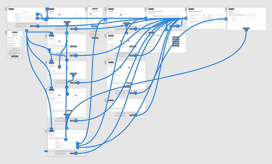
Low-fidelity prototype
I created a low-fidelity prototype by connecting all of the screens involved in the primary user flow of reporting a bug and requesting a new feature.
At this point, I received feedback on my designs from users about items like placement of buttons and page organization. I made sure to listen to their feedback and implemented suggestions that addressed user pain points.
View the DigiDoodle low-fidelity prototype.
Usability study parameters
Usability study findings
Study type
Unmoderated
Participants
5 participants.
3 males, 2 females.
Location
Canada, remote
Length
15 to 20 minutes
1
Categories
On the homepage, some users weren’t sure which would category to click on for their specific type of feedback.
2
Forums promo
Some users were confused about the community forums promo and wondered if that was where they were to submit feedback.
Refining the design
Mock ups
Based on the insights from the usability study, I made changes to improve the clarity of the feedback categories. I re-worded the categories and added a few more to accommodate more diverse needs.
I also included introductory text to describe what to expect from the community forums.
Mockups
Based on the insights from the usability study, I made changes to improve the clarity of the feedback categories. I re-worded the categories and added a few more to accommodate more diverse needs.
I also included introductory text to describe what to expect from the community forums.
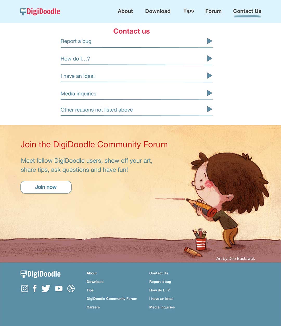
High fidelity mockups
I included considerations for additional screen sizes in my mockups based on my earlier wireframes since users can enter the website from a variety of devices.


High fidelity mockups
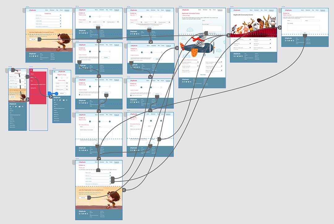
High-fidelity prototype
My hi-fi prototype followed the same user flow as the lo-fi prototype and included the design changes made after the usability study.
View the DigiDoodle high-fidelity prototype.
Accessibility considerations
1
2
3
4
Accessibility considerations
1
2
3
4
Takeaways
Takeaways
Impact
Users shared that the design was intuitive to navigate with a clear visual hierarchy and images were engaging and made the process friendly.
“So easy and quick to use!”
What I learned
Users like to contact creators of the apps they use for a variety of reasons such as feeling like they are helping to improve the product and are part of a community.
Next steps
1
2
3
Fun fact: illustrations used in the mockups designed by rawpixel.com/Freepik.
Next steps
1
2
3
Fun fact: illustrations used in the mockups designed by rawpixel.com/Freepik.